Renaming, Remaking and Restarting

Hello old friends!

I missed you all and sorry (again) I went missing. I always come back after months of inactivity and always say it won’t happen again, but it always ends the same way: I disappear. However, this time it was different. I took a long hard look at myself and the blog and tried to figure out why it seemed like I couldn’t write anymore after last year’s crazy rhythm. I think I figured it out.

At its core, the reason I stopped writing was that I was jailed to a specific set of themes while writing, as a result of the title of the blog: “Just Geeky Stuff”. The problem here isn’t the “Geeky”, but the “Just”. It is a barrier, a huge one, but, after a great deal of thought and consideration, one that I torn down.

So, meet my “new blog”: Ed’s Space for His Rambling Thoughts. Personally, I think it is a much better description of myself and my writing. It also opens a door to different experiences and, as a result, this tiny site finally becomes what it was meant to be: a window between me and you, that goes both ways.

Thank you for reading! Hope you have a great day.


Photoshop and Illustrator – Class 4

Thomas_Demand_1

Daily #15, Thomas Demand, 2011

I shouldn’t use Thomas Demand work to start off again, but I really enjoy it, I think they this fantastic aura that makes it seem magical when it is a representation of ordinary scenes. And that is the exact feeling I wanted to get in the last work, with the toothpaste tube, and I did achieve it to a degree, while there was still room for improvement. As a result, I was really happy to have another chance to work in a virtual sculpture, however this time it was bound to be more complicated and we were asked to form groups.

I was grouped with Sara, an Italian-Brazilian student, and Krittin (Nino), from Thailand, and our instruction was to make a clothing piece and wear it in the end. Sara commented that she had a pair of pants that she wouldn’t be wearing anymore as paint had fallen in them and we could cut it up to scan and print.

Here it is. While it seems very nice, it was actually a very bad choice for this project, as it stretches and has these two holes in the knees. The stretching bit means that, in its “normal” form, the pants would be impossible to wear, which is not a problem when using fabric, as it can adapt. However, paper doesn’t have the same propriety and, at the end, we weren’t able to wear it. The knees also posed a slight problem as they had a very thin fabric under it, which effect is also impossible to replicate with paper.

This slideshow requires JavaScript.

Our first step was to cut the pants up, to allows us to scan each “pant” individually. Also, it is important to note that we had to scan each pant twice: once the front and once the back. Naturally, we had 4 pants, two out of stretchy leather (the front) and two out of an unknown material (the back), and each was scanned twice.

Here are the points we marked as the cutoff points when scanning, which worked fine mostly. There was a slight problem with the size of some of the printed pieces, as they were not in the same scale all the times. When that happened we had to go back and scan these points again. Another problem that can be seen here is that the back is actually slightly bigger than the front when taken apart. To fix that, we had to cut some of the back off in the finished product, as the normal fixed this problem by stretching the top.

This slideshow requires JavaScript.

Here you can see the exterior part of the front of the right light and the exterior part of the back of the left. These were scans we had to repeat as they were originally in the wrong size.

This slideshow requires JavaScript.

After printed, we had to organize all the pieces in groups (each part of the pants) and shave them down to the right sizes.

The first image shows the pants individually and the second depicts the problem I talked about earlier: the back and the front have different sizes. This is because of the difference in materials, the back is its natural size while the front has to be stretched to be wearable. Our next step was to put all of the pants together individually and progressively reconstructing the pair of pants.IMG_20170802_125913840

While doing this, we noticed that it would be, in fact completely unwearable, so, to create the illusion that it was filled, we put small bags of air inside the pair of pants.IMG_3847

IMG_3787

The finished product as well as the beginning of the experimentation.

As seen here, it almost works. Another interesting thing is that the pair of pants can stand on their own.

IMG_20170801_130743102

This was technically be taking advantage of the other group’s work, the incredible paper shirt, but it did create a cool image.  One thing that I really liked about their project is that it reaches almost Uncanny Valley levels of discomfort as it seems almost too real, by not being made of individual prints (they went to a professional printer to make bigger sized prints). Next, we took the pair of pants outside…

IMG_3793

… to a nearby market, for example. It almost looks like it is being sold, however, some things get in the way of that impression. To name a few, the way the top part of the pants looks loose, but that same feeling is not replicated by the paper, the white line in the left leg, which I forgot to cut out, and the colour difference between the first two sections of the pants and the rest, caused by a glitch in the printer. This was our first attempt at outside experimentation with the pants and it shows, it is very shallow and obvious.

IMG_3823

Next, we took it to Spitafields Market and tried to make the pair to look as humane as possible, by which I mean it almost became an invisible human. It almost seems to emanate an aura, despite its technical shortcomings.

This slideshow requires JavaScript.

Next, we tried to make it stand by itself using a pair of shoes as support, however, that was not possible, as it kept falling down as the result of the wind, seconds after it was put down, as seen by my presence in all the pictures. We had to change our strategy.

It simply is not as interesting as it standing by itself, it removes that sense of humanity from it, becoming just a thing standing in the corner. Even from afar, it looks very fake, to my displeasure. I couldn’t seem to accomplish what Thomas Demand creates with his works.

These two were the best pictures from this attempt. There is something very powerful about the way the businessman is walking, without wasting a second of his time to look at the strange object in the corner. For the father in the next picture, it is the opposite, it is very interesting to see him “resetting” his viewpoint after staring at the pants to look at something much more important: his son/daughter.

This slideshow requires JavaScript.

We decided to be cheeky for the next one and put it in one of those rentable bikes. It doesn’t really accomplish much, in my view, as there is neither a sense of being or the feeling of an object.

This slideshow requires JavaScript.

Our next stop was Liverpool Street Station, where there is no wind so we could make the pair of pants stand by itself, even if it took a long time (it did take about 5 minutes). As there is a lot of movement there, many pictures could be taken and we tried to make the most out of it, as seen above. Naturally, some are stronger than others, so here are the highlights:

IMG_3810

While the pants are clearly fake, they take an almost supernatural aspect by simply standing there and this picture plays that up very well. A small but fascinating detail for me here are the shoelaces of my shoes, they take a form that almost seems to indicate sometinhing bigger.

IMG_3800

Here the effect comes from the dissonance between the way the man with the cap reacts to the pants, staring at it, and and the way the man with the suitcase does, ignoring it completely. The dynamism of the second’s movement, the way the back foot is phasing, also creates a sense of passage of time that I find captivating.

IMG_3808

And this one is the overall best picture we took. It is just mesmerizing. From its muddled colours to the perfect representation of a frozen moment and, finally, to the way it gives the sense of something much bigger, as if we are not seeing the full picture. Our teacher commented it resembled the poster for a horror film and that is another valid reading,  that it represents something much more nefarious than a simple pair of fake pants standing by itself.

In the end, it seems I managed to achieve that magic I mentioned in the beginning, even if through other means than near-perfect technical abilities.

Thank you for reading!

Photoshop and Illustrator – Class 6

Ugo-Rondinone

Whitechapel Gallery

This one is a bit different from the rest of the works here because it is not based on anyone’s practice, only on ours. And it also has a widely different purpose: to “sell” the exhibition us, Art and Design students, are making with our own works. It should be clear, by now, that it is a flyer. We only had two “limitations”: we had to explore both Photoshop and Illustrator and it had to use something related to our own practice as a background. Also, the title of the exhibition (Here Comes the Sun) and accompanying text were predefined by us. In the end, we should each have 5 options sent to the teachers and they will choose the best one overall to be

Personally, it was my first time doing something like this, so it felt a bit daunting, especially the bit about using Illustrator, but I feel that everyone felt like that about the software. No one had the slight idea about how to use it as it was the first time for everyone, except for printing images, which everyone knew how to do, of course.

IMG_20170720_100915550

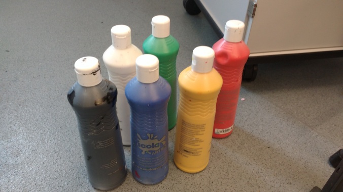
My first choice of image was a quite simple one, of the bottles of colours I used in part of my project. Darren did comment afterwards that it looked like “a primary school” project, and I agree completely. However, it was good practice and warm-up. I decided to use Photoshop, as I was simply more comfortable with it, at least to start off with.

This slideshow requires JavaScript.

I used the System font for the title, which was actually a bit of a random thought. I thought that it would create this sense of “basicness” and that did happen, to a degree. However, this doesn’t mean it was successful as a flyer. It simply didn’t show enough of my or anybody’s practice to actually work.IMG_20170720_113248584

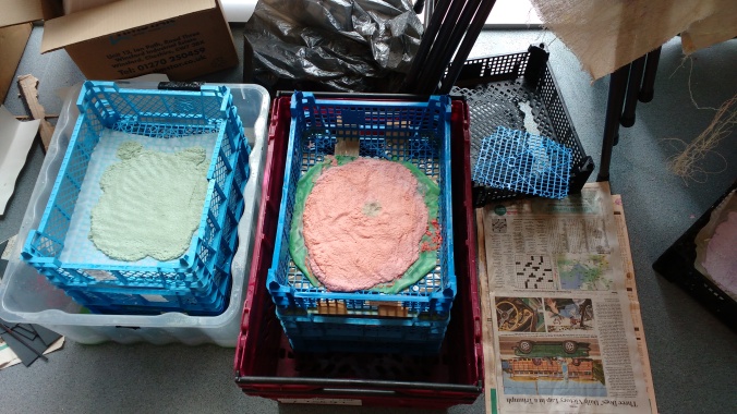
Next, I went with an image that actually showed something related to my work: the drying sheets of some of the paper I made. It is unclear, but at the same time quite inviting, I thought, as a result of the sun bathing the main subject of the picture.

This slideshow requires JavaScript.

While the image was fine, I feel like my flyer came out very childish, even more so than the previous one. This happened because of the placing of the text, very traditional and safe, especially the title, as it simply stood in the blank space, creating no interaction with the image itself. The choice of font also feels off (it is Baskerville Old Face) but I can’t really put my finger on why. 15

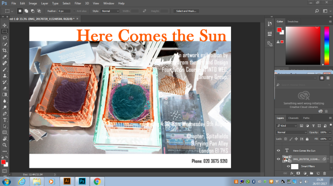
In a desperate attempt to make a decent poster, I decided to invert colours of the poster, which was simply too much of gimmick to work. Maybe if instead I had moved around the text and changed the title font, I could have managed it.

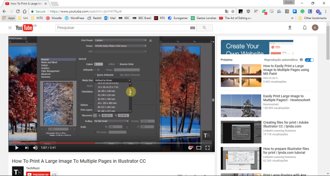
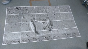
For the next one, I decided to finally experiment with Illustrator. I  wanted to use one of the pages from my sketchbook with the text removed and figured it would be a good way to work out the interface of Illustrator. 1

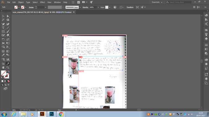
My first attempt was to use the Sice tool, as, in Photoshop, the same icon is used for a tool to cut out a section of the image. This is not true for Illustrator as, as seen above, it only divides the image in a very interesting way. To better understand this, I tried researching a tutorial and found this3

From what I understood, the Slice tool is used to slice the image in sections and save each section individually, which is not precisely what I wanted. And so, I tried something different in the interface and saw the knife tool. The logic behind this was that: I want to cut things and knives are used to cut things. This time, I first searched for a tutorial:

4

The knife tool is used in an image to cut it apart, creating two separate images, which sounded perfect and the video made a point of showing. It gave examples of straight line cuts, curved and even zig-zagging ones. However, I couldn’t figure out how to create a square shaped cut, as when I tried to do it, an error message about needing to be different from the anchor appeared. My limited knowledge didn’t help to decipher it, unfortunately. Seeing that tutorials were not being as efficient as I hoped, I went back to my usual strategy of holistic learning.4

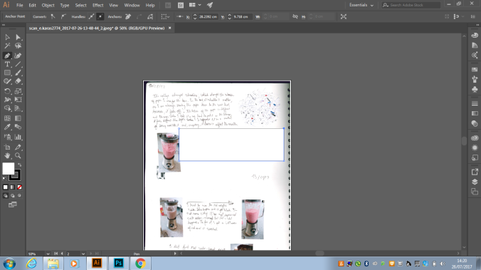
Perhaps a bit weirdly, I tried using the Pen tool and it seemed to work at first, however it left a black line around the area that seemed to be removed (no idea what this got to do with pens, though), which was simply not wanted.8

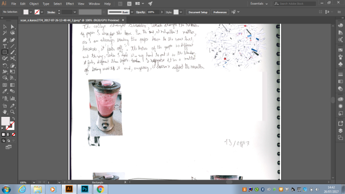
Next up was the rectangle tool and, alas, I found my answer. I put it in complete white and it mostly worked, however, there was a bit to the right that overlapped with the “shadow” of the scan, but I thought it was a non-issue. I proceeded to cover the text in the upper part of the page too and was ready to add text. For that, I moved back to my usual habitat: Photoshop.11

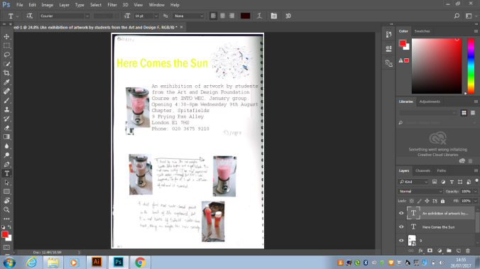
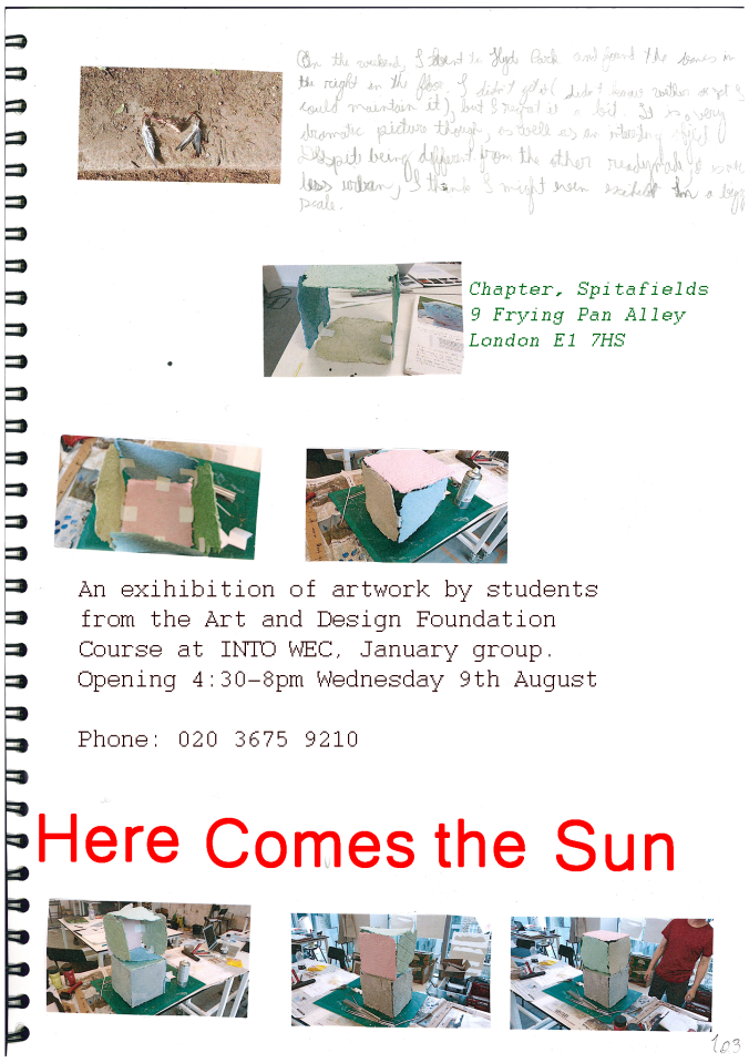
I used what has now become my favourite font, Courier, for the body of text. I love the feel, speed and dynamism it gives and my inner hipster loves the “vintage” aspect it has.  The choice to leave some of the original text in the bottom was a conscious one, as I felt made the poster very authentic and true to the idea of showing what the exhibition would be about. Moreover, my writing is so bad it kind of looks like small drawings. Another important thing here is that the ball of paper shreds in the top pairs very well with the title Here Comes the Sun, for obvious reasons.Here Comes the Sun 3

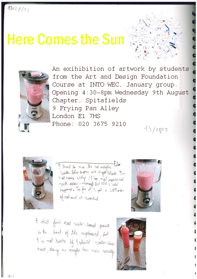
Seeing that the sketchbook page worked well, I did as most films studios do: an unwanted sequel.1213

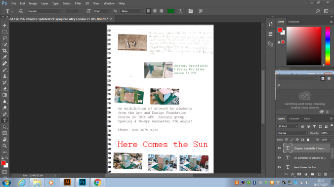
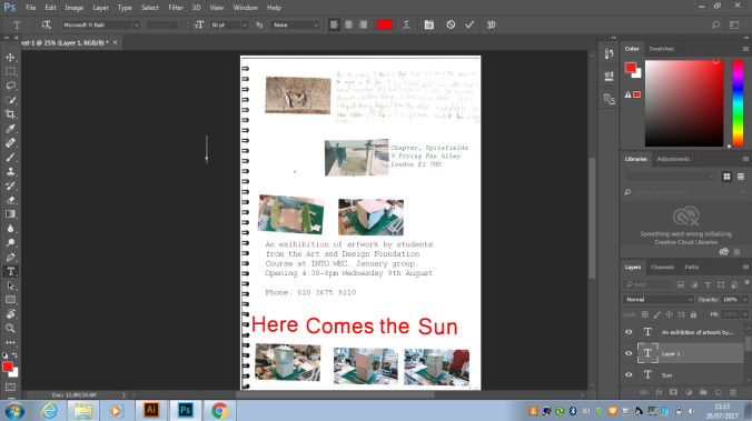
Now knowing the process, making the poster was quite straightforward, so I decided to spend more time toying with the fonts. Easily, 15 minutes went in choosing the title font. In one hand, I got to Courier, which doesn’t look as good in a bigger size, but, still, it is my favourite. On the other hand, I had Microsoft Yi Baiti, one of the weirdest names I found, but with an absolutely lovable shape. I had to manually decrease the spacing between the words, but it turned out nicely, if a bit asymmetric. Because of the work I put into it, as well as how inviting it looks, I chose the second option.

Here Comes the Sun 4

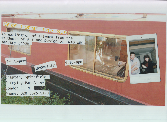
For the next one, I wanted to be novel. So, I got a picture I took on the previous weekend of an open window of a boat in Regent’s Canal and decided to do a “collage” with a picture I found on the street on that weekend (another part of my work is “readymade sculpture” or finding objects to call art).2

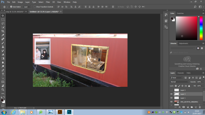
I did it digitally, by first getting the boat picture, scanning the photograph of the two people and then putting them together on Photoshop. The result, as seen above, is extremely artificial and simply not the feel I wanted for the poster. As a result, I decided to do it analogically, at least in part.

This slideshow requires JavaScript.

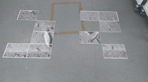
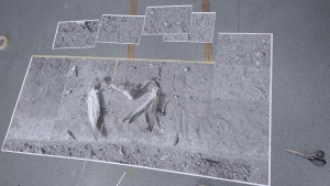
I printed the picture of the boat and placed it in the scanner together in the scanner with the photograph. It achieved two very important things: it made the work seem much more authentic and made the two pictures have the same grainy feel. I added the text and pronto! I had my best poster, but why stop there, I thought? Why not make everything in the same process. So, I printed the text, cut it up and started experimenting with different formations for everything.

This slideshow requires JavaScript.

I was very pleased with it, however, one thing I didn’t account for was the fact that I couldn’t keep the same shape when putting it in the scanner, both because of my own inability to think about spinning things like this with precision and also because of the nature of the scanner, as, by putting the picture over the small elements, they would change positions, even if slightly.Here Comes the Sun 7Here Comes the Sun 8Here Comes the Sun 6

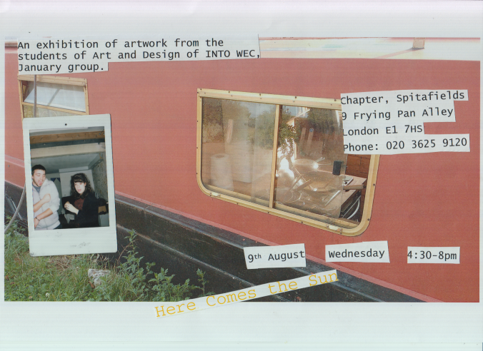
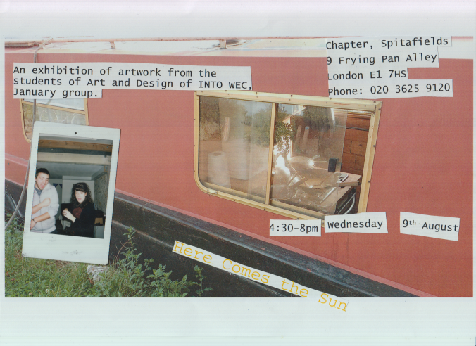
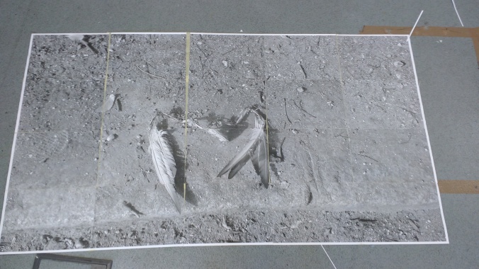
I put them in order of preference and note that the one I liked the most is nothing like any of the ones I had planned. The way the lines intersect and indicate chaos is absolutely fascinating. I couldn’t have come up with it, only chance could and that only heightens its beauty. It did not win the contest, but, honestly, I would be mad if it did, as the one that did win was just absolutely fantastic, standing much above the ones I presented here.

Thank you for reading!

Photoshop and Illustrator – Class 5

atl_01

Attracted to Light, The Starn Twins, 1996

Going a bit away from the digital sculptures and Photoshop in general, we were presented composite images by artists such as the Starn Twins. The idea behind this is to make small things, in the case above, a mosquito, I think, I am not an expert, much bigger than usual. Depending on the scale in can even be two or three times bigger than a person. Of course, we could only go so far. Another thing is that we would have to do it in Illustrator, which even our teacher didn’t know how to do, but he knew it was possible.

IMG_20170717_172926506 (1)

Perhaps a bit inspired by the “nastiness” of Attracted to Light. I chose to use a picture I took during that weekend, in Hyde Park: that of a bare pair of wings. It is pretty gross to be honest, and I wanted that for another reason too: the finished project would be put in the wall and I wanted to see the reaction to something like this.1

So, to start, we were given a youtube link for a video tutorial with no voice, which I personally felt very comfortable with. I used similar tutorials a lot when I was younger, to configure many tech-related things. However, there was a slight problem in that the menu was slightly different between our versions, which was mostly harmless, except for one thing. IMG_20170718_141601245

I had no option to change the type of page I wanted to use to print, as the only one was the default, which I later learned to be A4. Another thing to note here is that the scaling is set to: “Tile Imageable Areas”. I forgot to go in the setup section in the bottom left corner of the pop-up, as I thought it was already configured to coloured and to only print on one side.  It was supposed to print 24 A4 pages.

IMG_20170718_141937280

It only printed one, in black and white, with pictures on both sides and an error message right across them. I had no idea as to why this happened and, frankly, I still don’t. But it gave an opportunity to fix my mistakes.Wings

Which, unfortunately, didn’t happen. I forgot, again to go into the setup and fix the colour and printing on both sides. That said, I changed the scaling to “Tile Full Images” hoping it would fix the previous problem. It also brought the page number to 20 pages, which pleased my pocket immensely (I thought it would print in colour).

IMG_20170718_143935825

As it was double-sided, I only had half the number of pages I wanted. I put it down on the ground the best way I could, but then I had to make a decision: do I print it all again correctly or do I just print with the same settings again? I chose the second one, as I was curious to see how the image would look like in black and white, even if I kind of brute forced my way through the process.

IMG_20170718_150103237

With all of it printed and ordered correctly, all that was left was to put it together. First, I cut the white margins to be able to put the images together properly.

IMG_20170718_160829943

Then, I started putting them together from the back with plaster tape. It was tiring work and long too, took me a bit over one hour to put it all together, but the result was pretty good to be honest. It left be a bit uncomfourtable to be honest, which is good. And the black and white proved to be a happy accident, as it made the picture much more dramatic.

IMG_20170718_161919805

Here it is possible to see that I tried to compensate for the glitches that occurred during printing, especially in the second column. By spacing them apart, it wasn’t quite as blatant as it could have been. However, it is still clear, especially in the rightmost wing, which was eaten by the computer.

IMG_20170718_161832299

One nice thing about being double sided is that there was an image in the back too, which was also interesting in its own way. It tells a completely different story from the front one. To me, it even tells a story of a bird crashing in some steps, losing some feathers as a result.

IMG_20170718_162333651

With that done, I could go and attach it to the wall and that is what I did. I could choose either a white wall or an orange one. I went with the second option to create a contrast between it and the black and white of the image. I am not completely satisfied with it, it just doesn’t work well together. If I had the option, I would like to see how it would look against a black wall.

Overall, this is my favourite activity we made during Photoshop class, from the artists referenced in the beginning to the liberty we had, as well as simply brute forcing through a problem. It was much more organic in my view, as the other ones felt a bit more clinical.

Thank you for reading!

Photoshop and Illustrator – Class 3

IMG_20170705_125748495

As stated in the previous post, my job for the class of the 5th of July would be to make a toothpaste tube out of paper. Thankfully, I was almost done with my toothpaste already, so I used it today morning, wasted a bit of it and brought it to class. I cleaned it with hot water as best as I could in INTO and proceeded to cut it open so that I could scan and print both its inside and outside.

IMG_20170705_131155641

The plastic bit on the top was the hardest part. I cut it in six more or less equal parts, but, while thinking about it later, I noticed that it would have been better to treat as a hollow cylinder. The reason for that is going to become later down the line.

I scanned the parts, printed them and then started to build the sculpture. I began by doing the easy part, the tube itself. It is important to note here that I had to scan both the inside and the outside part of the tube, as to make the sculpture “feel” more real and possess “weight”.IMG_20170705_144820589

Here is the tube already finished and, as you can see, it is decently convincing. The light does not strike it as it would in the original, but that is a result of the difference of materials (paper =/= plastic). Next is the complicated bit, putting the tip together and then connecting it with the tube itself.

My first attempt was to put the tip together by itself and then afterwards fix it to the tube. However, it did not work. The reason for that is the fact that I could not make a full circle, only a half-circle. Which made it impossible to create the space the toothpaste comes out from. If I had cut the tip only once and made a cylinder, this would not have happened, probably. When I noticed it would not work. I changed my strategy:

IMG_20170705_153637687

As you can see, I pasted the six parts of the tip directly to the tub. After that, I molded each individual part by hand until it took the shape I wanted. This part of the process took about one hour to be completed.IMG_20170705_161437451

In the end, though, the result was satisfactory. Not perfect by any means, but it does manage to fool the viewer at a distance and even up close, depending on the angle.

Finally, I decided to take the finished product to its natural habitat:IMG_20170705_161553581

In a bathroom, it is even better camouflaged, it could easily be mistaken for its “real” counterpart, to the point that the “fake” almost became “real”. The next project is going take this to next level, as the objective will be to create a piece of clothing out of paper, scanned from a “real” object.


Photoshop and Illustrator – Class 2

big_277485_1248_Thomas-20Demand2_big

Hydrokultur, 2010

For the second class, we were reintroduced to the work of Tomas Demand, pictured above, a German photographer who creates sculptures out of paper that look almost real, photographs it and then destroys it. The teacher described it as a “virtual” sculpture. Demand’s intention with his works is to make the viewer question their trust on pictures or, in other words, that a picture does not prove that something is real.

Inspired by this artist, we were asked to make a similarly “fake” sculpture: a single leaf.


As you can see, mine is not perfect. The two sides are not perfectly cut to fit each other so you can see the white of the back piece in some places. Said that this can only be noticed with careful observation. At a glance, it does serve its purpose of being a “fake” leaf. Seeing as this was for the Photoshop class, next we had to scan it and use the hue/saturation feature to play with the colours.


First, seeing that the colour of the leaf seemed a bit off, I tried to make it a bit more natural. Which is weird, considering I used technology to do so, but I think I managed to do so.


Naturally, this lead to me trying to make it look more unnatural. So, I made it red. This changed the nature of the leaf, all of a sudden it starts to look more like a bizarre organ than a part of a tree. Of course, this perception is not a strong one, being more of an illusion.


The last thing I did in Photoshop was to invert the scan of the leaf. The smaller veins became much clearer and it became even more alien than before.

Next, Darren said that we should do as Demand and photograph. However, we did it out in the streets, not in a studio, and we did not destroy our work afterwards. Anyway, here are my pictures.


It is actually quite hard to see it clearly out in the world. In a way, this is a testament to the fact that despite being a fake, it looks quite convincing. These examples are decent, but the best picture I took was this one:IMG_20170704_155321596

I saw that there was a brick missing in the wall and so I put the leaf there, as a filler. Because the background is black, the colour of the leaf pops a bit more. I also enjoy how colourful the picture ended up being, as a result of the graffiti on the wall.

Our next class will also be about making a “virtual” sculpture but it will a more complex one. In my case, a toothpaste tube. To be honest, I am quite anxious to do it.

Thank you for reading!


Photoshop and Illustrator – Class 1

The last term of the course I am in (Foundation of Art, Design and Media at INTO London WEC) just started, as did the module Applications of Photoshop and Illustrator. For the first class, as a “warm up”, our task was rather simple: take pictures outside, with one of the three primary colours, and make some basic changes to it.

In my outing, I took a fair share of pictures, but, in the end, the choice came to the above two. I decided on the left one, in part because it looks distinctively London-like and in part because the one in the left was a bit too blurry. The second one, however, is still very interesting, as there are people in central position and also because of the strength of the yellow in the frame.

To start off, we had to crop the picture. Straightforward, not much room for error. I decided to direct all of the focus to the mailbox because, even in the full picture, it jumps at you and I wanted to enhance.

Then, we had to zoom in and crop.  I noticed the guy in the back and wanted a closer look, so I zoomed in him. His position is absolutely fascinating, what kind of movement leads to that? He seems to be holding something in his left hand, a cell phone, probably, but why is the right hand up then? Guess I will never know.

Following that, I altered the brightness/contrast of the image. I tried to find a good balance to make it look pleasant, the colours pop a bit more now and the sense of the city is even stronger, as a result of the slightly lower brightness.

The most exciting bit came then, in the shape of toying around with the hue and saturation of the image. To make it even more fun, we were supposed to do it 5 times. The first time, obviously, I put the saturation to the max. If only done slightly, it enhances the picture, but when done to this point it creates a psychedelic figure. The metallic grey became orange, brown became orange too and white got a cyan tint.

I am not sure what happened here, I think I made a mistake when exporting it. But on the right, you can still see that I basically nullified the saturation. My idea was to make it look like a black and white movie, but that still had a hint of colour. It worked, I think, but not nearly as well as I would have like.

I figured it was time to experiment with hues, and so I did it. The colours changed, but it just is underwhelming I think. Maybe if I had upped the saturation it would have been more interesting. Fortunately, that is what I did next.

The result here is what I expected. And I do like it, it seems like it was taken straight out from Yellow Submarine. I especially like how the man’s shoes contrast to the bright purple of the road.

This one is a bit more subtle, so here is the original again:IMG_20170627_144634561

Figured it out? I removed all of the logos

I removed all of the logos and advertisements by selecting an area and then erasing it. I noticed how many of them were in just one simple image and it annoyed me, to be honest, so I just removed them. It is hard to notice, but, once you do, the meaning is pretty obvious.

The next step was to add text to the image. I chose the white font and a big font (200px) so that it was actually readable. As it was a reasonably simple exercise, I tried to be a bit artsy with the message: questioning what is in front of us.

Next, was to invert the picture, which is to make it look like the negative in a film camera. It is a really simple thing, but I love the result, it seems alien, as if you were looking into an alternate reality.

Blurring the image was the following order, I used the Filter feature of Photoshop. Safe and boring.

It is pretty obvious that then we had to do the opposite: sharpen the image. Again, boring and simple. The thing about the sharpen though is that it looks artificial and forced, while the blur at least seems natural.

The final part was to change the colour mode of the picture and look for changes. Here are they:

IMG_20170627_144634561

Original (RGB/8bit)

This is also RGB, but with 32bit of colour depth instead of 8. The red lost its intensity, but there seems to be a lot more of variance of colours, especially on the ground.

Here it is in CMYK mode with an 8bit colour depth. The colours are much less strong and the contrast between them is much less noticeable.

Again, CMYK, but this time with 16bit of colour depth. While there seem to be more variety of colours, they are, individually, even weaker than before.

16

Lastly, I experimented with the Alpha mode, which, to be fair, I did not know what it was. As evidenced by the picture above (I forgot to export it from Photoshop), it is a pure Black and White. It reminds me a lot of the very first films made, in which it was impossible to distinguish colours. And, to be honest, was my favourite change of the picture.

And this was the last part of my first class of Photoshop. Every step we took was straightforward and, generally, simple. To be honest, it left me bit bored. I hope that it will speed up in the coming weeks and we get to the more interesting parts of the program. Also, it will be interesting to learn more about Illustrator, as the only thing I know about it is that it is vector-based.

Thank you for reading!


The joy of drawing

Like most kids, when I was 3, 4, 5 even 6, I loved to draw. Just to draw, nothing specific. Everything was fun from trying to put what I saw into paper, as well as trying to materialize whatever thing I had created in my mind. And the paper was that: an infinite playground. Always fun and accessible, if a bit nonsensical.

img-20170129-wa0001

Me, 3, drawing for fun

Mind you, in my case, the drawings were not great in any way, probably they only made sense in my own mind, but they were magical all the same. But, like with most things in life, this changed when school became a bit more serious and people started comparing each other. During art class, all of us children were asked to draw and soon it was clear that the others, with the same age as me, could draw much better than me.

From that moment on, until my last art class in Brazil, as a 16 year old, drawing and everything else done during art classes became a source of shame and sadness. Even while giving my best, my works paled in comparison with those from others, and I knew it, that hurt the most. Of course, this had a profound effect in me: insecurity and a strong shame of myself. Still, it was something minor, drawing was something I did very rarely.

However, my course here in London (Foundation in Art, Design and Media) requires me to draw and, to be honest, that was a source of a lot anxiety about coming here, even making me question my decision all together. Nevertheless, I came and that proved to be the right choice, as quickly the focus here is not on a realistic representation of the world, instead it is on experimentation with materials and concepts.

But that is not what is important about the classes, what truly mattered is that they are an open space in that, yes, some people draw better than others, but no one is made fun of because of that. During one of the classes, our teacher, Phil, asked us to make as many sketches of the school we could in about an hour, however all of the drawing was to be made on newspapers. In the following class, he made us walk around Central London making sketches of buildings and streets. These two events, for some reason, awakened my long-lost sense of fun while drawing.

After doing the sketches around London, Phil asked us to draw some parts of our way back home. I decided I would go back by foot and make about 9 drawings along the way. The trip, which normally takes 40 minutes, ended up encompassing about 3 hours. The whole tie, I had a huge smile in my face, despite the cold and the funny looks people made at me.

Well, I didn’t write this just to show off or anything of the sort (ok, maybe a bit). My aim with this is actually making you a bit happier: if you were like me and hated drawing or even if you weren’t, but stopped for some reason, try drawing again, just for fun, like a child.

Hey again. I realize this is all very anecdotal, but I wanted to try my hand at writing something like this. It its a necessary experience. Nonetheless, I hope you enjoyed this selfish text of mine. If you did, please leave a like and if you want to ask something, or just talk, just a drop a comment 🙂

Movie Critique – “Café Society”

Cafe_Society

Every year, Woody Allen directs and releases a new movie. Every year, me and my father watch it. At this point, it is one of the few traditions my family maintains. Which is great, but also brought a new problem: we can not be impartial in relation to Woody
Allen. Still, this yearly viewing made his style all the more clear to me and, surprisingly, Café Society manages to be different from the rest of his filmography.

Directed and written by Woody Allen, Café Society holds the distinction of being the first movie the eighty years old director filmed digitally. Another important “first” is that it is the first partnership between Woody and Vittorio Sorano, the cinematographer of Last Tango in Paris, Apocalypse Now and Café Society. Its main cast is made up of more familiar faces to Allen, though, such as Jesse Eisenberg, Steve Carell and Corey Stoll, as well as newer faces, such as Kristen Stewart and Blake Lively.

We are first presented to Bobby Dorfman (Eisenberg), a young jewish man from the Bronx in, in his way to Hollywood in the 30s, the “golden age” of movie-making. He quickly tries to get in contact with his talent agent uncle, Phil Dorfman (Carell), who gives our protagonist a job and introduces him to the vibrant cinema lifestyle, as well as his assistant, and lover, Veronica “Vonnie” (Stewart). Quickly, one of the marks of a Allen movie forms: a love triangle between a lady and two men, one younger and the other older.

However, this is not the only characteristic of the director that is easily identifiable: the jewish and neurotic protagonist, much like Mr. Allen himself, and his jaded lifeview, given life by Jesse Eisenberg, who reached a whole new level for his acting in Café Society. Another telltale mark of Allen’s movies is the presence of a narrator, this time the director himself, but it is a bit different from the norm, as he is not a character, nor does he offer insight of his own, merely presenting objectively the facts. Continue reading

Manga Critique – “Rookies”

230px-Rookies_(manga)

The cover of the first volume, with the protagonist, Koichi Kawato, centralized

Manga comes in many forms, from a realistic slice-to-life to the wildest fantasy, but the sports genre is the one that most frequently treads a path between the real and the fantastical. At first glance, Rookies seems to be an example of the first kind of sports manga, except it actually isn’t, as it is a “sports manga that isn’t a sports manga”.

Rookies is a “sports” and drama manga written and drawn by Masanori Morita between 1998 and 2003. It was serialized in Weekly Shonen Jump and ran for 24 volumes, that is, about 230 chapters. It also received a live-action television series and even a movie afterwards. Unfortunately, it was only officially released in Japan, Italy and Taiwan, which means the only way to read it in the rest of the world is through *ahem* shady means. I, personally, recommend batoto (an account is necessary): http://bato.to/comic/_/comics/rookies-r663

The baseball team of the Futakotamagawa high school (shortened to Nikogaku) has been suspended for a year from all official matches as a first year started a fight during a game. As a result, all serious players left the club and only the thugs stayed behind, only because the clubroom is comfortable, and spend everyday without a care other than girls. Koichi Kawato, a novice and optimistic teacher kicked from his first job, is hired to be the homeroom teacher of these students, as well as the counselor of the baseball team. The story revolves around Kawato and his desire to reform the team, by giving them a dream: the Koshien (the stadium the finals of the high school basebal championship are held).

Continue reading